Ready for an award refresh?
We're the perfect partner to help you breathe new life, energy and meaning into your recognition program.
10 Big ReasonsThere’s no doubt that Rivanna is a recognition company. We love making eco-friendly awards and plaques for our customers. But at our core, we’re a design company. Our design team works to create unique products, implementing your logos and accolades in the most visually pleasing way possible.
For Rivanna customers, ordering awards is a simple process: you upload your artwork, we create your award proofs, you approve them, and we ship your awards. Behind the scenes, of course, there’s a lot of thought and care that goes into creating your award master artwork and proofs. To help you understand the elements of good award design, our Junior Graphic Designer, Cynthia, compiled 5 typography tips:
1. Understand what makes up a font
The word “font” is often used incorrectly. Instead, people may actually be referring to “typefaces.” A typeface is a set of fonts, or font family, while a font is a specific size/weight of that typeface. (Ex: Times New Roman (TNR) is the typeface while 12pt, bold, TNR is the font).
Typefaces can be categorized into four main groups: Serif, Sans-Serif, Script, and Decorative.
There are ways to manipulate fonts. Kerning is the distance between two letters. Adjusting the kerning allows letters to be set closer together or farther apart. Leading (rhymes with “wedding”) is similar, but vertical. Adjusting the leading changes distance between horizontal lines, making text more legible.
2. For one award design, use 3 or fewer fonts
Less is more. Fewer fonts make stronger designs. Resist mixing a variety of fonts in one design. Instead, familiarize yourself with different typefaces/fonts to determine what will work best.
3. DO NOT distort fonts (without good reason)
Changing the height or width of a font can disrupt the readability of a set of letters or characters and how well they work with one another. If you are tempted to distort a font because it doesn’t look right to you, we have a simple solution: choose another font! There are many similar fonts and you’re bound to find something that matches up with your vision.
4. Maintain a clear hierarchy
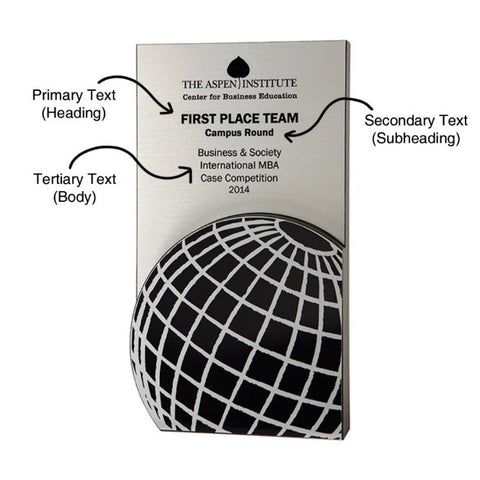
Award designs should follow a hierarchy, showing a clear distinction between primary text (heading), secondary text (subheading), and tertiary text (body). This Latitude award is a great example:

5. Don’t be afraid of negative space!
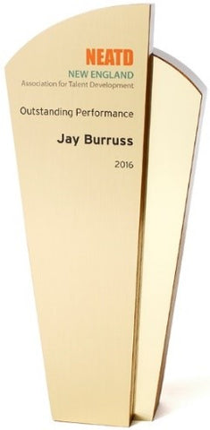
Negative space can be intimidating, but it actually gives your type space to breathe, making sure different design elements are not competing for attention. It’s also easier on your viewers’ eyes. Paying attention to negative space can prevent your award design from looking too crowded. By focusing on text, this Relay Gold award layout leaves enough space between lines for better readability:

The good news about purchasing awards from Rivanna is that you don’t have to put any thought into award typography. We’re happy to do that for you. However, if you are interested in learning more, there are some great resources available. Want to make your own font? Check out Calligraphr. Not quite there yet? Start by following TY x CA, The Daily Type, and Butter Type on Instagram.
We're the perfect partner to help you breathe new life, energy and meaning into your recognition program.
10 Big Reasons